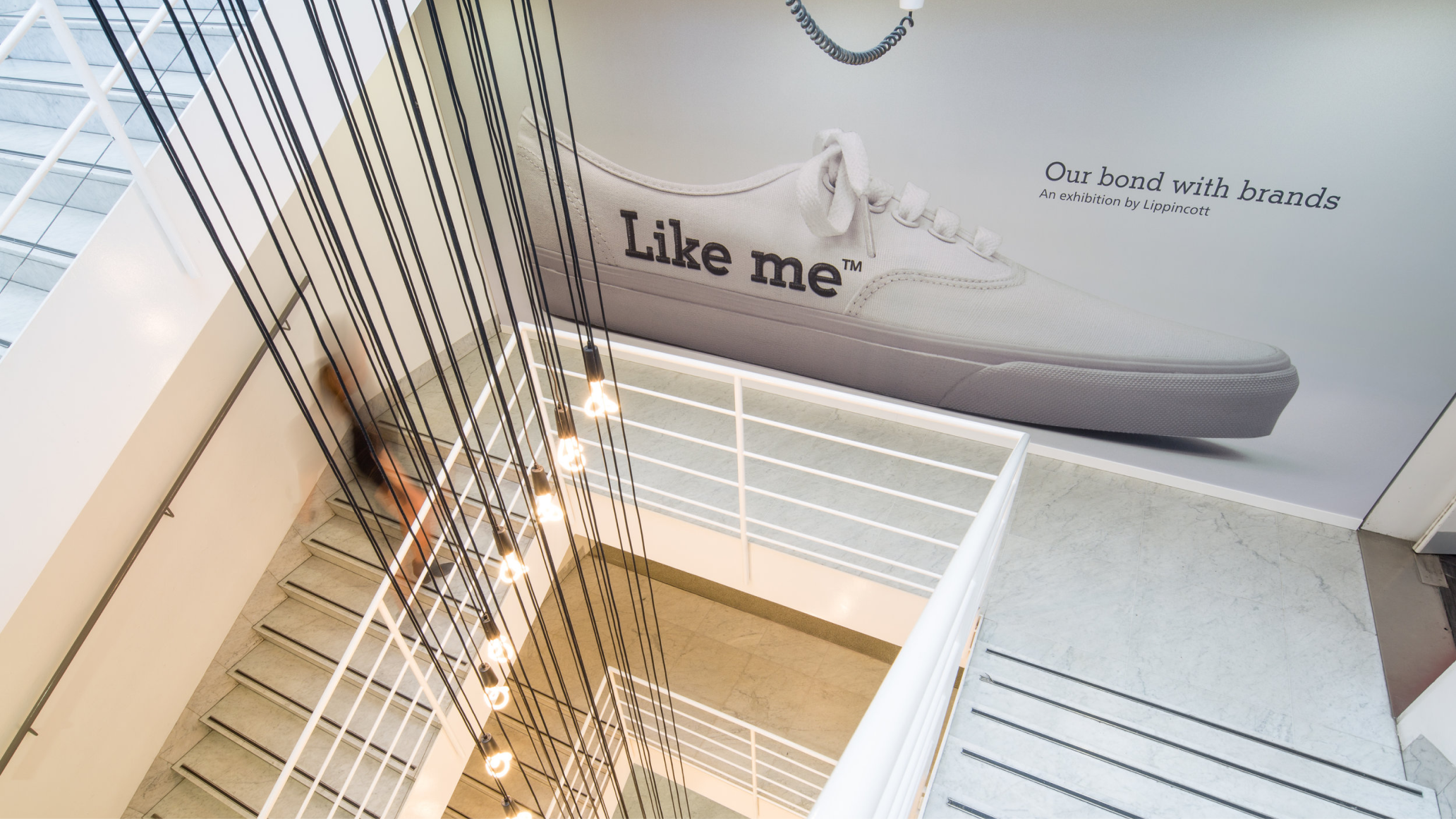
Lippincott is one of the oldest brand consultancies in the world, with a history stretching back to 1943 and a hand in some of the most recognized corporate identities ever created. Near the end of my time there, we took the opportunity to participate in the 2015 London Design Festival with “Like Me,” an exhibition about brands.
As brand practitioners, especially on the agency side, it often seems like we are molding brands to our whims, controlling everything from the underlying strategy to the most minute visual details about how they come to life.
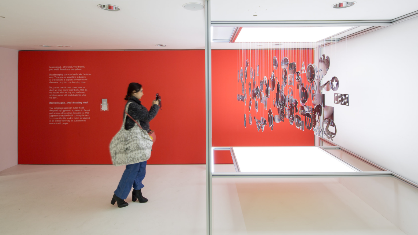
But the reality is that brands are in the eye of the beholder—in the control of the public. This show aimed to explore that push and pull between people and brands, wondering who is branding whom.
I was honored to be one of the lead designers behind this exhibition, alongside a fantastically talented team.
Credits
Brand designers: Elena Gil-Chang, Bethany Lesko, Vimmi Sveinson, Michael Keith Chapman
Design Partner/Creative Direction: Marc Hohmann
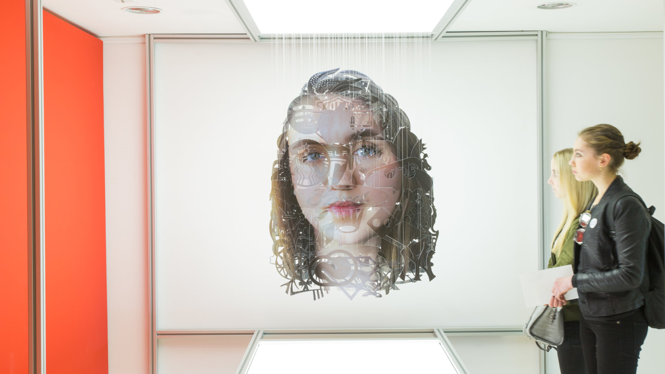
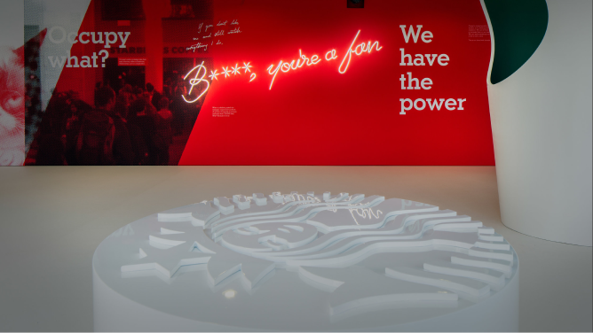
To get at the idea of how brands can help shape how we see the world and how the world sees us—and to create an object that drew museum-goers in—I recommended that we work with artist Michael Murphy to create a three-dimensional optical illusion piece. This is what viewers first saw as they entered the exhibition space.
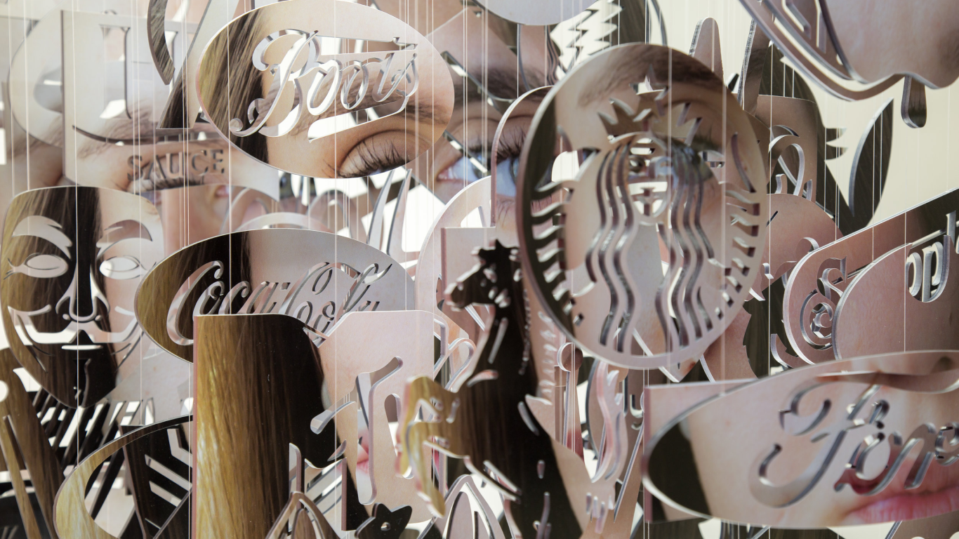
We experimented with pieces that felt tightly controlled—how brands may want to be seen—and contrasted them with ones that felt interactive and even unruly—a reflection of how brands can be subverted.
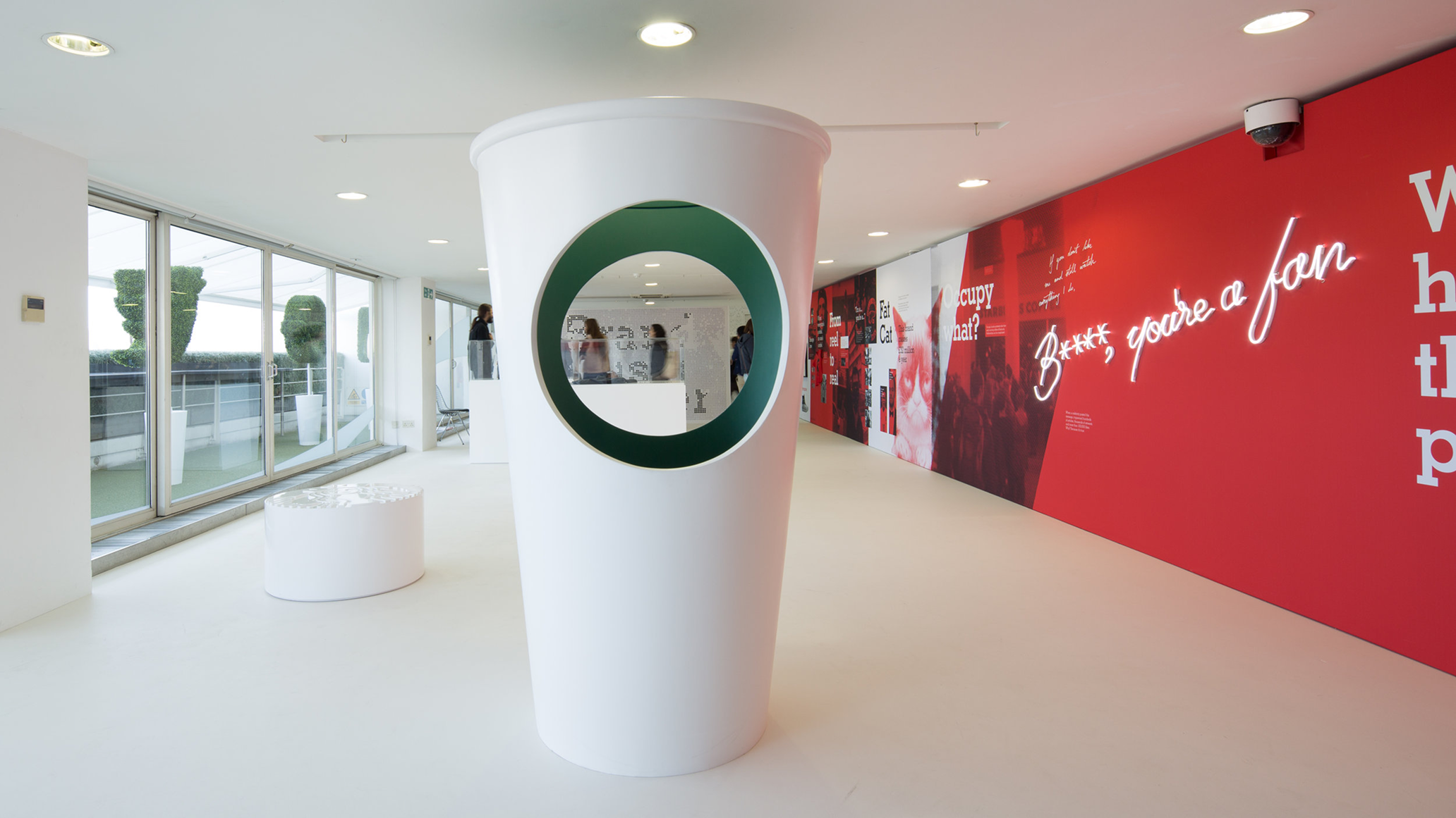
The giant coffee cup was an homage to how iconic Starbuck’s brand is, to the point that all you need is a green circle to get the idea across. But it was also a little irreverent, inviting people to pose with the cup and become the siren themselves. And of course, this was a subtle kudos to Lippincott itself, which had redesigned the Starbucks siren in 2011.
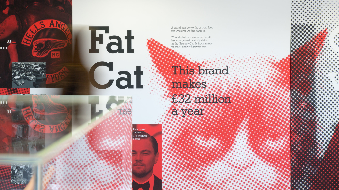
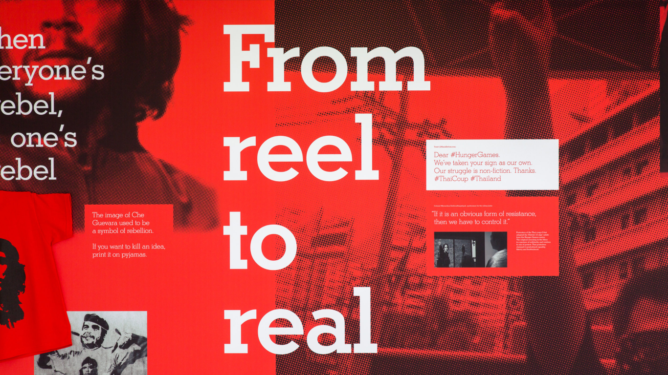
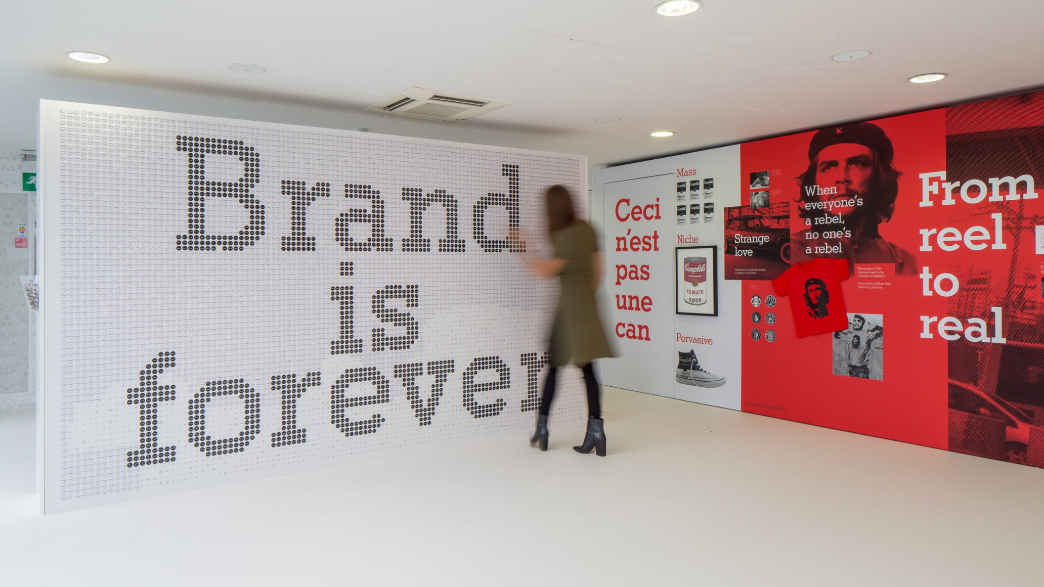
Along the longest wall of the exhibition room, we showcased examples of how brands can take on lives of their own as they are loved, hated, and transformed by the societies they exist in.
At the end of the exhibition hall, we installed a wall that replaced the well-known DeBeers slogan, Diamonds are forever, with… well, our own message. But there’s a twist on the twist: the white and black dots were actually enamel pins that museum-goers could take home with them, helping to erase the message. Underneath each pin was a tiny brand logo, a little easter egg for visitors to see which one they’d been matched with.
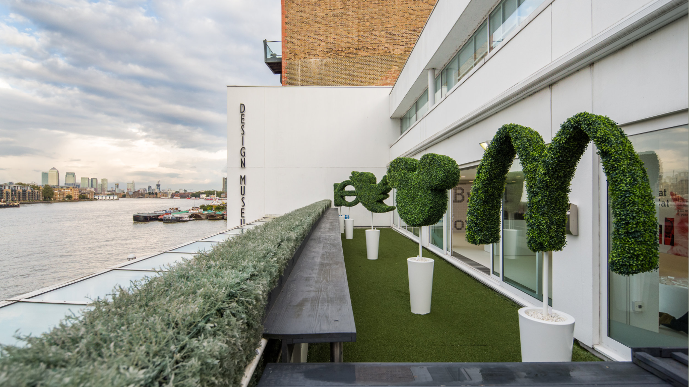
Finally, for the outdoor space, we kept things simple and a little cheeky with brand topiaries—a nod to a beloved English tradition, a form of living art, and a way to express one’s character and status.