Impetus for the rebrand
I joined Plaid in early 2018 and was tasked with leading a brand refresh alongside my colleague Ryan Smith. The existing identity was sophisticated, but leadership felt that it had become too rigid for Plaid’s broadening audience. The company now needed to double down on its developer roots, attract a wider range of job candidates, and still appeal to larger, enterprise clients.
Credits
Brand designers: Elena Gil-Chang, Ryan Smith
Brand design support: Norm O’Hagan, Andrei Korytsev
Design leadership: Al Hertz, Nick Agin
Illustration: Justina Leisyte
Animation: Jonas Elsgaard
Validating the brand positioning
Prior to my joining, Plaid had worked with an external consultant to develop the beginnings of a brand framework based on internal interviews. There was a lot of potential, but the framework was unfinished, and I wanted to understand which aspects were aligned with how external audiences perceived us.
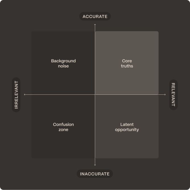
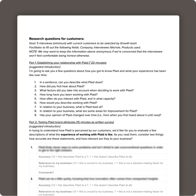
My first move was to propose and design an external brand evaluation: a structured research initiative to test internal assumptions against customer reality. I designed it around two questions—were there brand traits we’d defined that didn’t resonate with customers, and were there things customers actually cared about (trust, transparency, security) that weren’t yet reflected in our strategy?
Rather than testing for resonance alone, I structured the evaluation to measure both accuracy and relevance to customers’ businesses, separating “is this true of Plaid” from “does this actually matter to how they work with us.” The findings informed a refined set of four brand personality traits, which became the organizing framework for everything that followed.
Advocating for truly divergent creativity
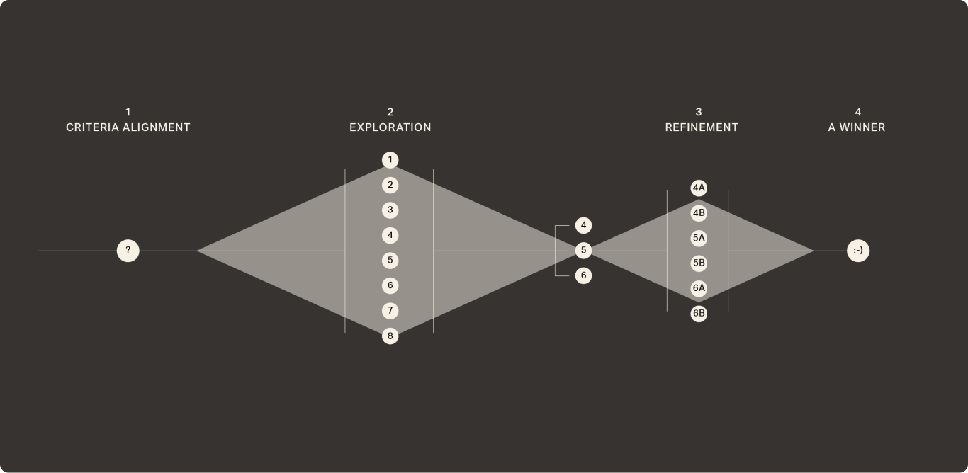
To maximize creative range, I involved the entire design team in early generative work before narrowing with my design partner. To keep concept evaluation grounded in strategy rather than personal taste, I structured the directions around the four brand traits—presenting divergent concepts for each. We then ran three finalists through UserTesting, measuring comprehension, affinity, and trustworthiness specifically, knowing a brand can be liked without being trusted, or understood without feeling relevant.
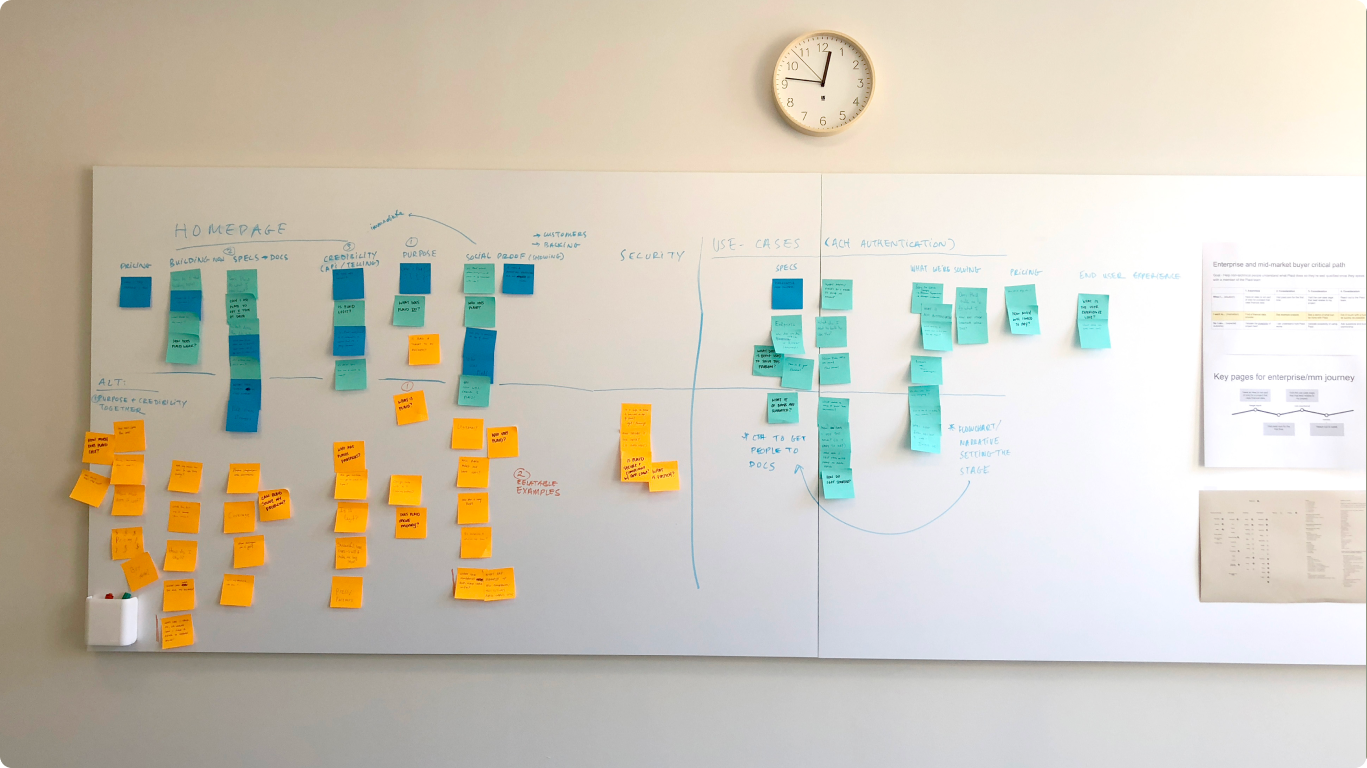
Building the plane as we fly it
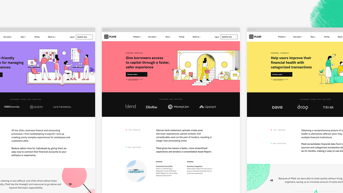
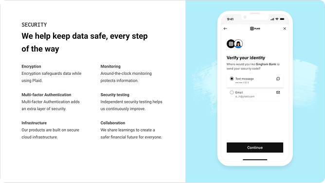
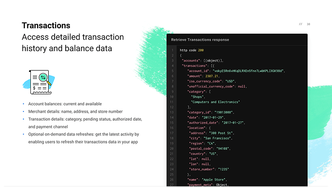
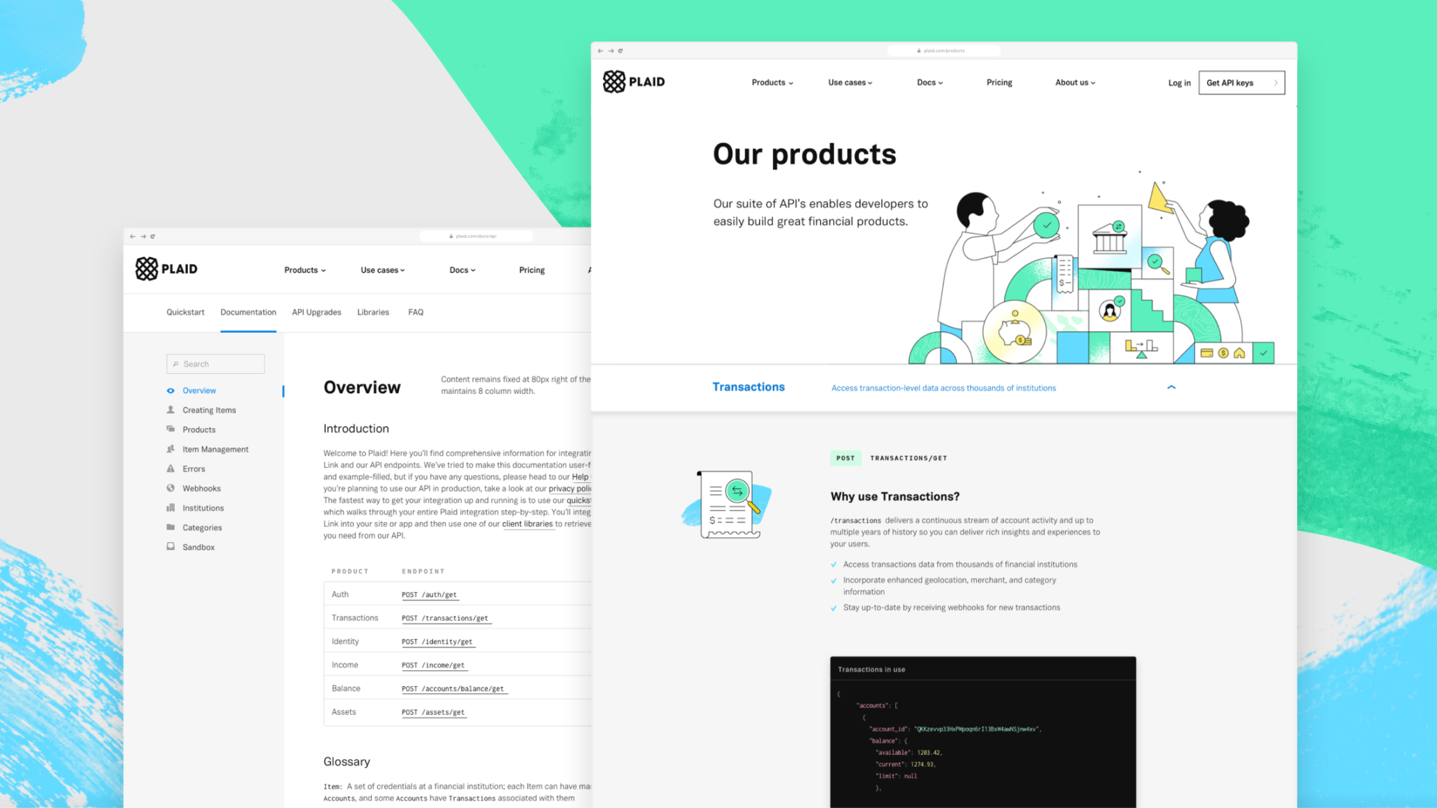
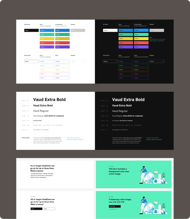
With a direction validated, we combined the strongest elements across concepts and published a preliminary set of brand guidelines. Leadership then challenged us to bring the identity to life with a rebuilt plaid.com. We audited the existing site, mapped key user paths, and built from there—bringing in illustrator Justina Lei for asset development while my partner and I handled concepting and art direction. We also built a new design system, creating custom elements where the brand required it while developing flexible, scalable patterns for sections we knew would need to grow.
Outcomes
The launch made the front page of Hacker News—a meaningful signal for a developer-focused brand—and the identity was distinctive enough that we had to flag a number of visual copycats to our legal team. On the business side, our north star metric was website conversions: we didn’t see a spike, but we didn’t see a drop either, which for a full rebrand is its own kind of success. The most lasting outcome may have been the design system: it became the foundation for Plaid’s product design system as well, creating coherence from the marketing site through the developer dashboard to the consumer experience.